Alaska Airlines - Rebook | product design
Project Overview
Rebooking a flight is a highly common task that happens on a daily basis at home or at the airport. Customers Service Agents (CSAs) help customers rebook at the airport for numerous reasons. Today, CSAs use a legacy tool that is incredibly powerful, but not the most user-centric. Alaska Airlines recently rolled out new mobile devices to CSAs in airports and are looking to expand use cases for them. By moving the rebook workflow on to these devices, we could make the experience smoother and more effortless while increasing value on the new iPads.
My role as the sole product designer was to work with a product manager, engineering team, and stakeholders to:
identify the problems and opportunities to solve for through discovery and testing
define a better experience and create a proof of concept for the mobile solution
help define the product roadmap
ensure scalability across our core apps and different user groups
I achieved these tasks by using research to drive product and design strategy in an agile environment. Rebook is a shared feature across our core apps in the airport group that my delivery team is responsible for.
*Note: Some content may fall under NDA so some content may be redacted or omitted.
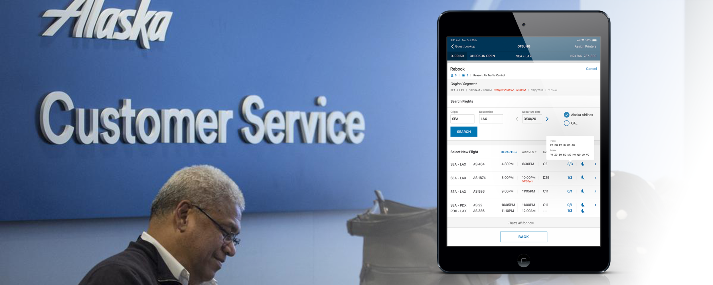
Background source: bizjournals.com; iPad example: Rebooking feature in a CSA app
THE PROBLEM
Today, our CSAs are using older legacy software to rebook flights for customers based on various reasons. The experience is fragmented, requires technical knowledge and training, and moves through complex workflows. Additionally, we knew that the task required comparing a high number of data points to make decisions, and it must be completed under the pressure of time and agitated customers.
THE OPPORTUNITY
Recently, Alaska Airlines started a brand new mobile program for CSAs in the airport that offers a role-based suite of tools to help move guests from curbside to the gate as fast and seamlessly as possible. In an effort to expand the functionalities on the new mobile devices, Rebooking was the next big feature we wanted to add because it happens often and is a required functionality in the operational ecosystem. The rebooking activity occurs in multiple places in the airport which means that the feature must be scalable across multiple apps on our platform in order to be used by different roles in different places.
After consulting with stakeholders, our hypothesis was that the complex workflow needed to be simplified down and some automation was needed to lessen friction. The digital transformation of these manual processes also means that our new solution needed to be better than the current system in order to increase user adoption on the new iPads. Through user research and building empathy, I found new opportunities to make a new seamless experience that would enable our users to better serve our customers in airports across the nation.
Photos from my airport trips
Discovery: The sky’s the limit
In order to start defining the problems, I worked with my PM and stakeholders to understand what we currently know and what we still need to discover. Luckily, the stakeholders and my PM had all worked as CSAs before moving into corporate roles so I was able to get a lot of insight and build really strong hypotheses early on. However, it’s been years since they’ve worked in the field, so I decided to bring my PM with me to a few airports to reconnect with the frontline. Also, by looking at current metrics on rebooking activity, we decided that the following plan would give us a very rounded perspective on rebooking:
visit 5 airports of different sizes and types of rebookings.
observe rebooks in 3 different areas of the airport.
interview at least 4 CSAs at each airport with experience on the entire spectrum.
By getting a mix of data, we are able to form a high level understanding of what was working well and what didn’t work well with current rebook experience. I also collected ratings to create a benchmark to compare with when measuring success for the new solution down the road.
Example of the legacy tool.
What we learned
Luckily, CSAs were enthusiastic about giving feedback to the company so we ended up interviewing more than 30 CSAs total. From from those visits, we learned about why rebookings happen, what are the most common scenarios, and how rebookings are accomplished with the current tool. More importantly, we experienced first hand the pressure a CSA faces from having a customer present when rebookings happen which contributes to the stress of the task.
From observations, interviews, and data, we discovered a few areas of improvement for the tool’s experience:
Though CSAs are incredibly proficient with the desktop tool, it was still a broken experience, often with hiccups in the workflow that require workarounds, training, or time spent to get to know the tool.
The tool sometimes required a manual process.
The current rebooking process is a complex workflow that involves a lot of different considerations to make a decision.
There was a big opportunity for device strategy as iPads were suddenly forefront as a new platform. The feature would need to be scalable across our suite of applications and support many different scenarios.
FRAMING THE PROBLEM
Generative research helped us understand the big picture rebooking process and where the areas of opportunities were. Now we had to identify the real problems to solve and break them down into bite sized chunks. In order to facilitate deeper conversations about some of the high level problems, I facilitated a brainstorming workshop to generate ideas.
MANY BRAINS ARE BETTER THAN ONE
For a few hours, I booked a large room with whiteboards and lots of writing supplies with the internal team:
business stakeholders / subject matter experts (SMEs)
product manager
engineers (front end and back end)
my design counter parts within the CSA group
The purpose of this brainstorming workshop was to start at a high level and then dive deep into some of the identified problem areas. I walked participants through a few exercises:
1) Affinity mapping - to uncover an unknowns through deep dive conversations and diverse perspectives
2) Crazy 8’s (in groups) - understand how are we thinking about innovation as an internal team
3) “I wish” + “Yes, and” story writing roulette - gain direction on strategy while getting the team to start thinking about the problem in different ways
MAJOR TAKEAWAYS
This workshop allowed us to quickly learn that there were a lot of complexity involved with this project. The biggest takeaway was when we identified a huge opportunity for innovation: a business process change that required automating a crucial manual part of the rebooking process today; something that possibly no other airline is doing as most airlines follow standard industry practices. This helped us define some goals for the new experience.
High-level metrics to measure success:
less number of steps and clicks
less time to complete task
seeing improvement in satisfaction and ease of use ratings
increasing activity for rebook within first 3 months of launch
less time it takes to train a user on how to use the tool
IDENTIFYING THE GAPS
By building an As-Is / To-Be journey with my team, I was able to identify the gaps in the current workflow, and then envision how a better solution might fill those gaps. By identifying the steps, we can figure out what how to simply the workflow.
The main gap in the current workflow is that information being manipulated at certain steps are isolated from each other. The friction within the tool is caused by a disjointed workflow and required training to use the tool.
We also identified that the core activity was to find new available flights. Our team recognized that this would be a great opportunity to test usage in the field while being a great temporary solution to filling the above gap in the workflow. Therefore, we moved forward to define the availability feature as the MVP.
Major challenges
INFORMATION OVERLOAD
Research showed that CSAs were considering a lot of different data points when making a decision with the customer on what flight to rebook on. The current tool today offers the ability to look see all of the information at once, but training is needed in order to decipher the way it is displayed on the screen.
SOLUTION - A GUIDED EXPERIENCE
focus the user one task at a time
hide information that is isn’t a necessity thought might be needed
carry over information and autopopulate
SCALABILITY
Research identified that this feature needed to be used by CSAs in 2 different roles which require 2 different experiences. We currently have 2 core apps that accommodate for those roles. Therefore, the Rebook feature would need to be scalable across both apps.
I consulted with both designers on those 2 apps about the potential experiences for the feature. I discovered that the experiences would ultimately be very different; one required a general end-to-end process, the other pulling in bits and pieces at different times.
So, how might we create a flexible workflow to accommodate different app needs?
SOLUTION - REUSABLE FRAMEWORK
split the steps up into chunks that can be used alone or as an end-to-end process so that it can integrate well with different app needs
work with engineering to build the feature as a framework that is reusable
TECHNICAL LIMITATIONS
Our systems are integrated with an older database that was not built for modern day technology. This limited the way we pull information into our new mobile apps which would ultimately impact the design for the new experience. The technical challenges we faced were primarily related to pulling availability data:
the database would only return a handful of available flights at a time which may require pagination
there wasn’t an easy way to filter results by airline on an initial search call
the database would only return a maximum number of available seats for a flight
the availability data pulled is static which is problematic when trying to secure the next flight
So, how might we design experiences to mask the friction caused by technical limitations?
SOLUTION - AVAILABILITY
took advantage of an existing pattern (mobile gesture) - scroll to load more instead of pagination to create a continuous experience and avoid more clicks
try to find a better alternative to pull flight info for both available flights and seats
OUTCOME
Just looking at the metrics from usability testing, my design improved the workflow significantly based on the following results:
condensed workflow with less steps, decreased by 75%
decreased number of clicks to 4 total (happy path), and eliminated typing
time to complete task decreased by 50%
no training needed to complete the new workflow
high satisfaction and ease of use ratings
CSAs expressed appreciation for building better products
These numbers, along with overall app usage, will continued to be monitored as this design is used in production in order to measure its impact on new iPad user adoption.