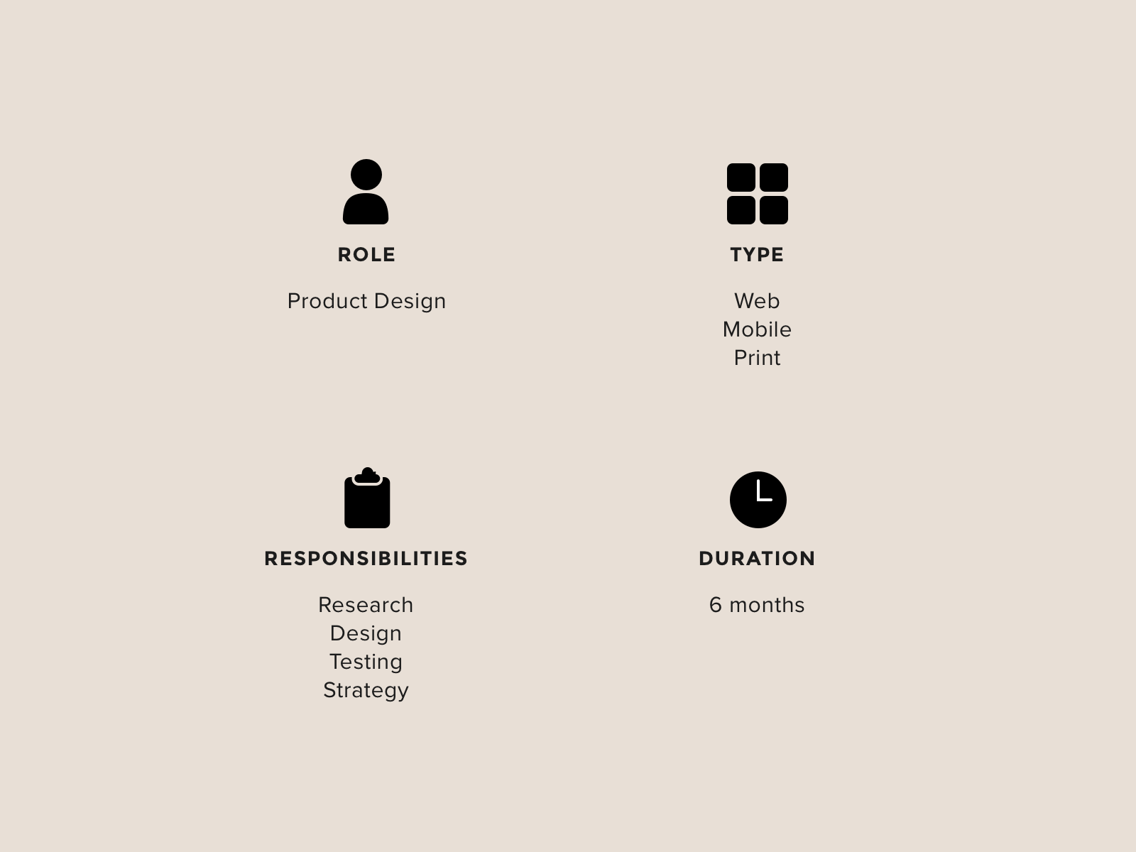
Starbucks | product design
Project Overview
In order to keep the coffee brewing, this globally iconic coffee shop from Seattle uses a suite of tools aiding stores to continue working towards operational excellence. This one particular tool is meant to optimize store engine efficiency by creating “store plays” that guide staff needs, show scheduling, and guide people placement. By knowing the needs of the store ahead of time, store leads are able to plan ahead and mitigate staffing risks early on. This tool is just one of many planning and scheduling tools provided by operations to streamline stores. Through data analysis and user research, my team and I were able to uncover a multitude of unprecedented problems to solve for.
My role as the sole product designer was to work with a product manager, data scientists, engineering team, and stakeholders to iterate and improve on the current version. We achieved this by using research to drive design strategy in an agile environment. This product is one of 7 products under the suite of tools that my two delivery teams were responsible for.
*Note: Some content may fall under NDA so some content may be redacted or omitted.

THE PROBLEM
I inherited this app as a browser solution released to store partners in the US and Canada. While metrics showed that the app was being well used, we were still hearing feedback that some partners did not trust the solution. Business was also pushing for expanding this app cross platform to iPads. This tool was meant to assist store operations, but it was built on 16 basic models that were supposed to apply to all 10,000+ different Starbucks stores. It was important that the tool is used to maintain a healthy level of performance. So, how might we build trust with our store partners so that this solution will work for them while also considering how to expand the device strategy for the tool?
THE OPPORTUNITY
After consulting with store operations stakeholders, the hypothesis was that the ecosystem of the tool was time consuming and data driving the guidance was inaccurate. Through user research and building empathy, I found new opportunities to make it more user centric and store centric to help streamline operations across our stores.
Source: Google
Discovery: going into the wild
After discussing the problem at the kickoff with stakeholders, we decided we wanted to do a contextual inquiry deep dive in order to understand what is happening “in the wild”. The goal was to help our team and stakeholders build empathy for our front line while investigating our hypothesis. Generative research would allow us to get immersed and really define the right problem to solve for.
We rounded up all the stakeholders from store operations, stakeholders on our product team (our director), the product manager, a lead engineer, and myself (the designer) to go into a few local stores to observe, ask questions, and time tasks.
An example of the a store engine layout.
Source: https://www.starbucks.com/promo/store-design
What we learned
By visiting the stores, we learned about their landscape and where devices were kept, we saw the context around their devices, how they were doing things inside or outside of the of the tool.
We discovered a few areas of improvement for the tool’s experience:
Store partners didn’t trust the tool because only a small handful of store layouts available for all 10,000 stores in US/CAN which we can solve for by bringing that layout count up to cover a larger percentage.
The tool was unnecessarily a manual process which impacted efficiency.
There was a big opportunity for device strategy as iPads were suddenly forefront as a new platform.
Phase 1 Strategy
After learning that there were in fact several opportunities for improvement, we first decided to address the lowest hanging fruit by implementing an interim solution while we figure out how to tackle a longer term solution because it required a larger business process evaluation in partnership with a stakeholder team. The interim solution was to shorten the time spent on the tool to manufacture artifacts digitally.
So, how do we give the time back to store partners to focus on more important things?
A store partner shows us how the tool is being used.
WHAT DO THE NUMBERS SAY?
In order to validate the complaint, we went to our data scientist to uncover how many minutes it actually takes a store partner to complete to the tool’s task. We found that data analytics showed time spent on the digital manufacturing of artifacts was not as long as the complaints indicated though still significant, even factoring in a buffer for interruptions in workflow (i.e. slow connections, bathroom break, phone calls, etc.). However, the data of manually part of the workflow could not be measured, so we suspected that the annoyance of such a manual process was causing people to perceive the amount of time to complete the task to be much longer.
HOW IS IT ACTUALLY BEING DONE?
To further validate our hypothesis about poor usability and that the tool was an annoyance, we invited several store supervisors to interview with me, bringing along my product manager, our stakeholder, and an engineer lead to observe and take notes. I asked questions about the current experience of the tool, what worked well, what didn’t, and to show us how they use the printed plays. I also collected sentiments ratings to use as a benchmark when measuring success of future solutions.
BENCHMARKING
In an effort to move towards a better solution, we dissected the existing workflow into a list of actions. We looked at KPIs such as time spent on the tool, active users during the beginning of each update cycle, and number of clicks. Measuring activity helps us create a baseline of numbers to compare to after the changes we make and to measure the success of those changes.
Goals:
Lessen time spent on the tool at the beginning of every update cycle
Lessen number of clicks per session
Improve sentiment ratings about the tool
IDENTIFYING THE GAPS
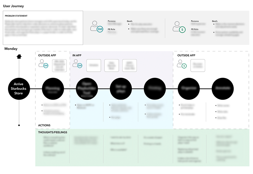
By building an As-Is / To-Be journey with my product partner, I was able to identify the gaps in the current workflow and then envision how a better solution might fill those gaps.
Through this exercise, we identified the two user groups who use this tool as a tag team effort in running their stores. The To-Be workflow is then created in comparison to the As-Is, visually documenting our hypothesis/vision of how we intend to evolve the tool. The maps also allow us to pin point which areas are bottlenecks to solve for. This artifact also serves as a great empathy building vessel, shared out to engineering team and stakeholders for discussion.
The main gap in the current workflow is that it is too prescriptive. The friction within the tool is caused by its inflexibility. Now knowing the opportunity we have to solve for, we can take this and apply it to our long term solution.
INTERIM SOLUTION
Given design resources limited to 1 sprint and engineering resources also limited to 1 sprint, we had to come up with an easy fix. After brainstorming with engineering (engineers have great ideas too!), we ended up with three t-shirt sized options. As a team, we decided on implementing the smallest effort solution that would make the biggest impact while minimizing changes to the current app’s architectural structure. We took from existing apps with a similar concept that has been tested to be successful, and reused existing components in our pattern library.
This was an easy and quick win that buys us time to look for a better long term solution.
USER FEEDBACK AFTER RELEASE
Product and stakeholder sent out a mass communication about new release through our internal channel. To our surprise, store partners reacted immediately and more strongly to new functionality than we anticipated. Even though it was a small change, they loved it! 🎉
This reaction was then validated when we looked at the activity on the next update cycle. Data showed that time spent in a session was cut in half! 🎉🎉
On the second update cycle from release, we found that the number of clicks decreased by 70% due to the new batch functionality! 🎉🎉🎉
PHase 2 STRATEGY
INCREASE DATA ACCURACY IN GUIDANCE
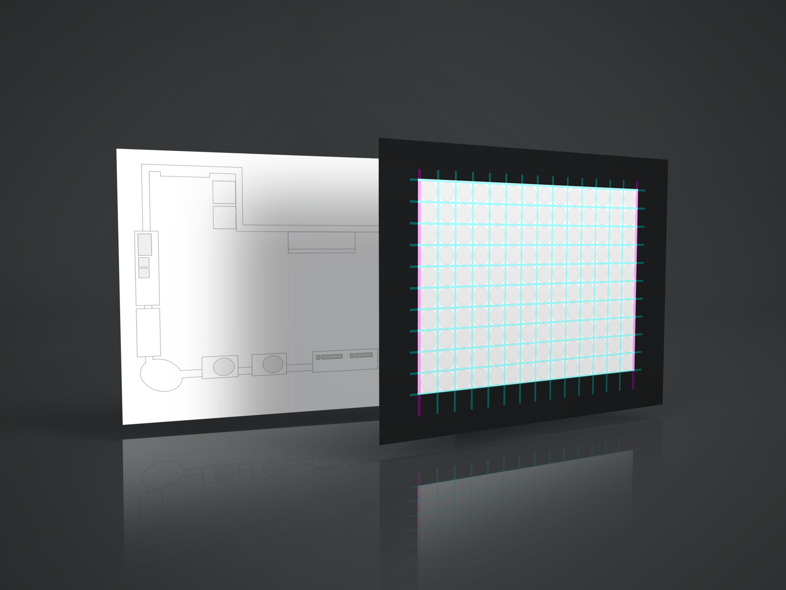
Many stores are built with the similar setup, but the physical layout differs from location to location. We decided to increase the volume of V1 layouts, currently covering 50% of the scenarios, to 80% of stores in US and Canada. This effort requires working closely with the Ops Data Science team, Store Standards subject matter expert, and our engineering team to:
understand feasibility and timeline for releasing new store layouts
identify scenarios to cover, prioritize those scenarios, and create a schedule for implementing them
create a new grid system (template) for drawing the store layouts manually and fitting data points to the new grid
to make sure french translations fit in the designated label areas
FALLING BACK ON LEAN UX
I originally proposed automating the generation of these layouts due to the sheer volume, but given the time and resources, our team (including product, engineering, data science, and stakeholders) decided against the idea and to create the layouts manually instead. We were willing to sacrifice a month on the roadmap to create enough layouts covering up to 80% of the scenarios since building an automated generator would take longer and require resources we didn’t have. However, the team agreed it was a good idea and something we would keep in mind while exploring longer term strategies.
Phase 3 strategy
DIGITIZE THE PAPER PLAYBOOK (LONG TERM SOLUTION)
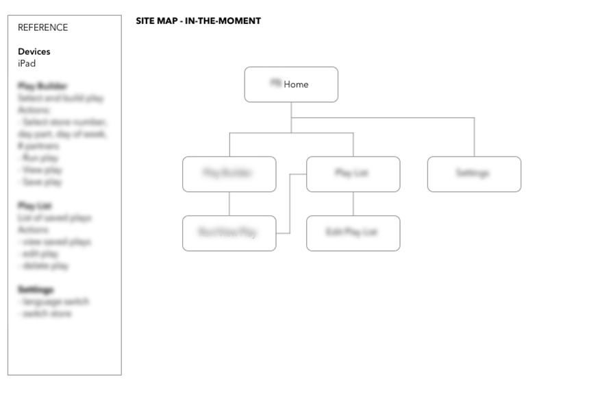
During the user interviews, 100% of participants requested for a digital solution to the current manual solution. This was a huge opportunity for store operations to take advantage of the recent roll out of iPads into stores. By creating an iPad version of this tool, it paves the way for mobilizing other enterprise tools.
In strategizing for the future concept, we started to look at how the app might work on an iPad by building out a hypothesis of the features and functionalities through a sitemap and information architecture diagram. We validated through the following:
Navigation was discovered through a card sorting exercise.
Audit of existing features to translate over into iPad version.
High level story mapping session with product, engineering, and stakeholders
Since we were able to buy some time with the interim solution, this is where priorities shifted and I had to table this for a future sprint.
Intended impact
During the discovery phase, research uncovered a business opportunity that was a surprise to everyone on the team. From observation and data, the tool required a high amount of printed paper per year that would ultimately be recycled every 6 weeks. Store partners often voiced their concerns for more environmentally friendly practices. Digitizing this tool would not only be a big cost savings and save on time, but it would build more trust between frontline and the business for staying true to our values by continuing to push forward the company’s green initiative.